Watercolor Series

I began my experimentation in watercolor when I went to Blick a few weeks ago. I'd become fed up with acrylics and their fast-drying nature leaving so many unused paint globs and having to continually purchase replacement paint. As well, it created a time sensitive issue so that whenever I poured globs out I had to paint for the next hour and a half or risk losing about $4 worth of paint (slight exaggeration).
At the time I didn't know the difference between tubes and pans and purchased the cheapest option I found which was five tubes of Van Gogh watercolors: the primaries plus black and white. They were $5 each. I immediately set to work trying them out - on my walk home from Blick I stopped at the library and drew two and a half pages of a short comic about wandering around Portland.
I loved that I was able to paint over my lines and still see what I considered interesting line work. I also liked how quickly the paint could be applied, how light I could make it, and how much ground I could cover in one brush full. One disadvantage was that if I made a mistake it pretty much showed up in my final work no matter if I tried to cover it up with the conspicuous white watercolor which I quickly realized had a different viscosity than the others.

However, when I next used my paint
Watercolor part II
online shopping isn't always a sure thing as I found out when I finally received the watercolor set and digital camera I'd been waiting for. First of all, they both came in a pretty big box and the watercolor set was smaller than my foot (which is proportional to the rest of my body, so smaller than most people's feet). Second of all, the camera was bad. I mean really bad. To show you how bad, I've taken a picture of the watercolor set with the camera.
However, the camera has been packed safely away into its box and is on it's way to the Amazon Lockers so it can't hurt anyone anymore. The Sennelier set can stay. Here are three watercolors I've done with it so far, taken with the only slightly worse phone camera. (You get what you pay for)


I got hooked on watching people carefully assemble their many-panned watercolor sets and hope to do the same eventually although I usually only use primary colors which makes the set I have perfect. I'm not sure why other people use more colors but for now I'll imagine it's because I'm better and more able to mix colors.
And now for the reference photos:
I only wanted to paint myself cause I thought my hair looked pretty. Interestingly, the last watercolor painting I did was of a straw monkey that I found collected in the guest room and I found it bore an uncanny resemblance to this painting of myself once it was finished.
"Try to Look Angry"
This moment, just minutes before we said goodbye, was taken by Tim and we were all instructed to glare at the camera. A sort of bittersweet moment, I had a hard time composing my face into such an expression as I felt a few feelings right than but for once anger was not in the mix.
Either way I like how this picture turned out, and already endeavored to paint it once in acrylic on cradled hardboard unsuccessfully.
which I've since done a bit more work on but am still not satisfied with.
My attempt at watercolor was more successful and took much less time, one of the reasons I want to watercolor more. I think it will make it easier to feel less burdened by unfinished paintings. Often I want to add color to make sense of an image but not get too obsessed with the particular light and dark tones. This way I can do a sketch, add a light wash, wam bam thank you mam and I'm done.
Also, I look forward to carrying my sketchbook and watercolors around with me. I've always dreamed of being able to make art on the go without a huge mess, now I will be. Not just to capture things around me but to perhaps quell anxiety that may or may not rise in the presence of public, stressful situations. I won't have to decide whether it's going to be an art day or not an art day - every day can be both.
As an aside, though, if this painting were really done, I might want to go back in and add a few more color tones, to our clothing. I had a pretty difficult time getting skin tones light enough and in the end decided to break out my white Van Gogh watercolor tube which was quite helpful once I finally found it in the bottom of my backpack. If there was a way to elegantly mix acrylic white and watercolor, I'd like to try. Otherwise, I'll have to reconcile allowing parts of the paper to show through without which I wouldn't be able to get the bright white I want.
"Tefilah"
This reference photo was taken ~6 years ago when I was an ozer at hebrew school during our singing session. I brought my camera to work one day and managed to take a few interesting photos of the kids doing various activities. Hopefully they're old enough now to have their parents not protest if I include their work online (as they did at Douglas Park a long while ago).
The photo quality of my phone camera doesn't do justice to the subtle color shifts in this watercolor painting as I believe I am getting more proficient at making it clear which areas are light and which are dark (what I wanted to do in the last one).
I've found it's not so terribly inelegant to simply add another layer of a darker color without any transition - it comes off as a stylistic quality. To manipulate the paint into mixing ever so slightly seems beyond my skill level at this particular time.
Anyway, I really enjoyed painting this odd perspective (looking up) and I love the positions of these girls who are very unaware that a photo is being taken. As I painted, I began wondering what had drawn these particular girls together. Were they the outcasts that didn't belong in a mainly-caucasion hebrew school? I loved the way Rachel (middle) was twisting her arms, trying to find something to do with her body while she waited, apparently bored, for singing time to finish.
My thoughts about these things reminds me of when Nicole Wong told me she always makes the expression of the character she's drawing. I think it might be a lovely way to get in touch with my subject and I'll address this again as I attempt to connect with my subject in this way in the future.
midnight email
Feeling somewhat put out by what watercolor might have to offer that I might be missing, I found Parvati's email (difficult) and asked her the name of the watercolor teacher she talked so highly of once when we came to visit. His name is Ted Nuttal and here is one of his portraits which I found online
He certainly has a wider range of tones than I've managed. I'm amazed he's able to achieve such detailed results with what I've so-far experienced as a pretty difficult-to-handle medium. I'm not sure I'm 100% invested in this portrait however as I feel he's exerted too much effort into making this definitely look like a person and his expressive techniques don't extend what he considers the "important" areas of the painting, for example the eyes.
Again, I'd like to remind myself that my goal isn't to spend as much time as possible on a sketch, but to find a way to easily and accessibly record things that I see in the moment. I'll try to remember to include my Sennelier watercolor set and the smallest sketchbook I can find the next time I leave my house which might not be today as I've found some cereal I plan on eating.
Well, as usual when I'm home alone by myself I got very dressed up, wearing lipstick which I almost never wear, and put my hair in not two but three braids. I was very nervous about using all the rooms but I did manage to do some walking - some dancing in the kitchen. Considering using the desk in the guest room and then there would just be about four rooms left.
This is what my Sennelier Watercolors look like now that they've been used! And I think they look better than they did before!
I woke up and didn't immediately feel like water-coloring. eventually I remembered that I could go outside which I did and it was very sunny - perfect watercolor weather. I drew (in pencil) and then painted the cactus and the flowers (chrysanthemums?) over by the guest house and combined them into one image (below).
it was a bit nerve wracking at first but when I realized that I didn't mind the pencil lines showing through the watercolor and in fact they improved them. In the end I liked the cactus and even though I felt kind of studios while I was making it the last few strokes contributed to it coming out looking loose. The flowers which I did second and having the big slashes of color amidst green leaves were very surprising and exciting and also very easy to paint. I know why people paint flowers and plants but I continue to think they're cliche and not what I'm cut out for.
The shadows around the base and sides of the pot were fun to add in but I'm still getting used to the way lighting and shadows work with watercolor. I keep forgetting how much I need to dilute colors if I want them to stay light. When I add a lot of water it becomes hard not to have them pool which means they make little dots. I tried this technique in some of the upper leaves - trying to add colors that weren't green especially in the rose picture - like the leaves were whispering explaining how to be painted.
spent a while watching youtube videos about watercolor this morning. A bit unnerving to see how many people are trying to do this thing and how little I like even some of the so-called successful paintings. Unlike acrylic I've yet to find an artist that I strive to emulate like I do Elmer Bischoff and now Celeste who we saw at the Hammer for only a brief moment. Perhaps it has to do with the connotation of watercolor as being flowery and beautiful as opposed to the dramatic and striking paintings done in acrylic.
Oh - there is one I would like to be like - whoever it is that illustrated the Roald Dahl books - TIME OUT
in my time out I found that the person who illustrated the Roald Dahl books is Quentin Blake and that he has a website where he describes every detail of his process. Even better he has various youtube videos describing and even showing the details which is a format I'm used to. So now I can't say there isn't anyone on youtube I've found that's like what I want to be doing. I don't know if I like his finished illustrations but I like their quality of carefree-ness and I want to at least strive to be that carefree when I illustrate the various ideas I have so that I won't get stuck up and muddled in the details.
In one objectively funny video, he describes drawing things that Dahl talked about in his books but didn't need any pictures of. The idea that a man so successful in his career would be going around drawing drawings that didn't need to be drawn - drawings of things like "hogswallowers" is pretty funny to me and also makes a lot of sense that he is the type of person they would have chosen for the job. Here is a picture of one of his illustrations from my favorite book Matilda (can you guess why?):
I was feeling a bit discouraged but after a long break and some re-invigoration after I looked at Quentin Blake's watercolors on his website
I came up with these sketches I allowed myself the permission to use those big bold outlines that I started with and I think it paid off once I found pictures I was interested in.
I started with a pretty traditional picture of someone on instagram bathing in a lake
I can't say I was satisfied with this one but part of it is that I chose this picture for the wrong reasons - I wanted to pick something that already looked like a typical watercolor painting - something sort of whimsical, mysterious, but without much depth.
The result was that I wasn't fully invested/interested in what I was doing. I think I got it right in the end, I kept fiddling with it until it looked halfway decent but I never fell in love with it. Part of what I liked in it when I chose it was how confusing it was that her hair was the same color as the night behind her but of course in the painting the confusion was all mine. In particular, her right hand stands out as not drawn well. If I had better paper I'd love to rework the lake as it had lots of ripples and folds and even different colors aside from the grays and blues in the other parts, however, I've already had to deal with a lot of warping and buckling with this tiny pad I picked up for $4 at Blick so I left it as is for now. Perhaps I'll go back when I'm more proficient and understand how to do washes.
I watched a number of videos about watercolor paper after having this experience and everyone says that "Arches" is indisputably the best. However it costs more than $1 per sheet. It's hard for me to justify spending that since I just started but I suppose part of it is that I don't think of paper as being expensive while I can understand why hardboard panel which is much more thick and solid, would have to be. (Though according to the manager at Aaron Brothers, it's basically glorified cardboard). In the meantime, I'll purchase some small sheets from strathmore that are just a better quality version of the size I'm using right now.
Anyway. I continued my watercolor experiments until I felt too sleepy to continue at which point I headed to bed. This morning I woke up having only slept 7 hours but wanted to continue. I ended up retrying an image that I tried a few times last night but was unsuccessful, and coloring in another that I had only outlined. The coloring in part is really fun, especially when I consider that I can discard the convention of filling every space. I actually really like leaving white space but I do have to get used to adding thin washes of color so that I can add skin tones and other light areas. I've found that anything besides a medium value is relatively hard to attain - trying to make a dark black takes work as I can't add too much water or too little or else it won't be paint.
I have too many drawings to include in this particular post - I'll do another one which will include the rest of my drawings from last night, and the ones I've already started today.
That's all for now folks :)
-Sage
By now you know very well about my intent to get better at watercolor and in more general terms to include art in every aspect of my life so that it becomes an extension of my hands rather than a "talent" that I can exploit to make money. Last night I worked on some more sketches, some of which I managed to watercolor before I got too tired, and crawled off to bed. I left a few untouched. I plan to go back and import all the sketches I've taken pictures of into illustrator so I can create something like a coloring book, which I'll then print on the closest thing I can find to watercolor paper that I already have.
The first sketch I added color to this morning was one of the people who requested their profile pictures be painted. I was itching to paint this strange photo of this dude I hooked up with in college once and for some reason has a non-white child resting comfortably on his shoulders. Was it one of those programs where you go and help them build a school? I couldn't be sure.


I think in even quicker intervals than when I paint with acrylics I went back and forth between "this is so hard, after this drawing I'm never doing this again," to "this is so easy; I want to do this forever." Perhaps it corresponded with different parts of the painting. In any case I remember being frustrated with having become impatient with the lightness of the colors on his face, and adding too much brown. I now feel impatient that I somehow neglected to color part of the dude's hair. I was overly pleased with myself for being able to "read" the letters on his shirt despite the obstruction, knowing exactly what those letters meant to Wash U students so many years ago when I attended the university.


Next up was this woman who I found on Instagram and chose to paint last night before going to sleep. I must say this was among the easier drawings I've ever done, despite my very real error when positioning one of her legs. I felt confident in the whole figure, enjoying that I got to leave her shirt almost completely white with its authenticity intact. I enjoyed the subtle arch of her heel and its way of wrapping around her foot. I debated whether to draw the design on her bag, settled for a shorthand, and ended up cramming the whole thing in. The finishing touch was a little extra color at the top of her sunglasses. Unfortunately the whole piece is compromised by the poor quality of the photo; I hope to regain my image quality when my parents return and I get my various gadgets fixed or replaced.
I didn't include the two okcupid dates I drew yesterday as I wasn't very satisfied with them. I did them while half watching the office. While I was taking a shower waiting for my phone to charge I had the idea of supplementing my book about dating on okcupid with some loose and gestural images of the men I dated temporarily to cut down on the time it would take to make the images, add some fast color and expressiveness to my book, and give it an overall more personal touch.


Both of these I redrew a few times. While I was inspired by the picture, I didn't like how when I cropped Tyler, the picture became grainy and his body like a blob. I realized I'd liked the composition of the original photo, with him at the very bottom in the sand, rather than any actual qualities. Even worse, his entire body was basically the same light red color. It became apparent I would have to fabricate differences in tone.


For the painting of Trevor, I found that the picture was almost too perfect to do much work with. His face was handsome and symmetrical, the photo showed a lovely captains hat etc. I drew his picture four times before I finally gave up and started using color, promising myself that despite the blackness of the line, if I needed to I could go back and rearrange the face if it proved necessary. In fact it did and I don't think it's hard to see where I realized that his face should be a little further up - more wide and less narrow. It was a pretty drastic change - ambitious to do in watercolor and like the improperly placed leg, did not turn out to be extraordinarily forgiving. I plan to go over it again in its digital version but for the time being I'm still pleased with the sketch. I spent a while gradually adding tones to the shirt which seems like a waste of time since I could just buy the pattern as it is, however the result was satisfying. I also liked drawing the hat. The face came easily and where it's character didn't match the reference, it didn't exactly find a new character which I considered a relative triumph.
Part VI
After turning a couple pages in my sketchbook while trying to scan it, I realized with great surprise that I'd done three more watercolors last night just before I dozed off. I must have been too tired to commit these wonderful little washes to my long term memory. As I said, I don't remember doing them and therefore can't remember the order in which they were made but I can imagine based on the order they're in in my sketchbook.

The first is an image of myself, crouched in one of my interesting non standing, sitting or lying positions that strangers tend to make fun of me for but I consider compact and also the healthiest way to sit (oh it makes your legs cramp? Well it's not my fault you had to go and get yourself legs for miles by drinking tons of milk as a child...). This particular picture was taken in the woods when we were packing up and getting ready to go home after our infinitely strange trip to the redwoods.
I've cropped the picture to some extent and the original takes up only a tiny portion of the page, perhaps illuminating how small I am (especially in this position) compared to everything else.
Next was this elegant watercolor. I wasn't just exaggerating the colors: this picture was taken using my old computer's webcam which was very bad quality and here has turned a lot of the picture to blues and purples.

The result was magnificent (at least in my mind) and finally produced a galaxy-like look which was difficult to achieve when my skin tone was a simple beige (as seen in other pictures). Fitting that I was also wearing my blue and white star dress, which I happen to be wearing today as well. (Imagine if I wore it with my galaxy $0.99 backpack, which I planned on doing before I couldn't find it when I went to Bardonna earlier today? Then I would be the whole milky way just within my outfit.
Speaking of my going to Bardonna, I wanted to take the time to share some tidbits from my time there. First off I ran into that dude with the long black hair who never lets me get a word in edgewise while I was paying for my food. I asked a number of questions about the pastries behind the glass and he ended up putting two not one of the yummy apple ones into a bag for me and charging me nothing. I don't often give tips to cafe employees but that was very sweet of him and undermined my guilt for spending extra money on a pastry when what I came for was a meal (the huevos rancheros bowl of course). I still have half of one of the pastries which I am saving for a little bit later if I get hungry.
 Back to the watercolors. The last one I did last night, and at this point I was practically snoring, was one of this adorable girl who I took a picture of in the park a while ago, painting on an easel which I provided. The drawing came out lovely except for her face and hair which was a little bit wider than I would have liked, however, when I started to add color, it sort of messed it up. It's hard to add a wash of light colors, especially when I don't have real watercolor paper (which I ordered on amazon after this drawing).
Part VII
I haven't been super motivated today. However, I have managed to get fairly far on the project which I planned in the shower on the first day I was alone in this house. The project was actually a response to a problem I hadn't quite figured out from when I was working on my dating book. I wanted to have some sort of representation of the men I went on dates with to get a better sense of them, but of course I didn't want it to be too visually accurate so as not to point to the real person in each of these dates. I tried various ideas - one was to convert a picture of them to black and white, another was to introduce a black bar directly in their line of vision, another was to create a pixelated version of their face with a program I was sure I could find on the internet. My last idea which I'd sort of settled on but hadn't the stamina to actually produce, was creating a 6x6" acrylic version of their face which would be as close to their actual appearance as my painting skill had progressed. Considering that one date I kept in contact with was fine with his pretty realistic sketch, that idea seemed pretty alright. However, not only did I not find the time or motivation to do these insanely ambitious 50 paintings, I still wondered whether they'd be enough of a disguise of their actual identity.
Therefore, the loose watercolor sketches I'd been doing solved both problems, and a third one of what to paint in watercolor as I was running out of reference photos. Not only were they a lot faster to paint - with just a quick sketch, some fiddling in illustrator, and then a wash of whatever color they happened to be wearing (all of them were white so their skin tone could stay roughly the same color as the paper), it also had the effect of further obscuring their identity as the sketches I've been doing, while perhaps capturing some sort of likeness are nowhere near photo realistic. To be able to guess the identity of one out of a pool of millions would be flattering to say the least.
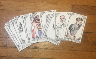
All that is to say I got started water coloring some sketches I had already made of the first 7/50 men I went on dates with in the 6 months I was in Portland. (Louis, David, Blake, Blake, Andrew, Adam, and Paul.
I first tried printing fairly large portraits that took up a whole page each. This style worked alright, however with so much ground to fill, even a shirt with a black background was time consuming. I only managed to do two in the what felt like a long time I was working on it (to be fair I was fairly engrossed in "Nailed It!" throughout the duration of my working time (which I've now finished, sad mostly because it means I watched like 20 episodes of a show based on a clickbait article)). Next I tried reducing their size so they all fit on one page. Well, this did hurry things up a little but neither produced the effect I was hoping for, partially because I'd already shaded the very dark areas in each portrait and black on top of my version of cross hatching just isn't where it's at. I had some fun addressing the many mixed drinks on one of my date's shirts which I now realize look altogether too similar to the plaid on the other dude's shirt.
My first attempt with two huge portraits:


My second attempt with the much smaller portraits: (I got these four done in a fraction of the time spent on the other ones. After this I'll provide a one-on-one comparison of the two in common so you can judge the difference(s) between them more directly)


Note that 2/7 are holding a female friend tucked into their arms. What does that say about my dates? What does that say about me???
Here are the two that I did both large and small. You can tell in the smaller one that the paper is getting muddied by the high saturation of water. Other than that I did like the larger one better, by a substantial enough amount to make the extra time it takes worthwhile. I plan to try making them a quarter of a pge next time and see how that works. If that fails too, I'll try half page until I realize I should've just spent the time doing more boys. But of course I have to find them through social media, go through our old messages looking for their last name or otherwise identifying information and that always makes me feel creepy, though I know it's about my drawings/my book and not them.


Oh, and I also did two more dates on a previous day, without the aid of a previously sketched drawing. These perhaps have a more natural look, causing me to wonder if it would behoove me to print the outline lighter so the watercolor becomes more in the spotlight.


Well, I'm sure y'all have comments about my date drawings but I'll tell you right now I'm not too pleased with any of them. I can only hope that as a body they'll look more impressive, and that when I get to drawing #49, I'll have finally figured out the right size to be printing them. That or I should just order watercolor paper and not have to worry about how the water reacts with this shitty printer paper.
Part VIII
Aaaand were back at it with more date drawings. This time I'm back to watching our dear Minnie and Robin rather than one of those life time movies and it's made a big difference a) not to have to pay as much attention and b) to feel like everyone is thinking about art where I am, and it's not just me doing my own thing in my mind. I'll start by posting the last three drawings I added color to. This time I made them a quarter of a page each and cut the page in half so I wouldn't mess up the first two after I finished the bottom ones. Being more focused and the new size which is the best so far contributed to quicker, and better drawings.


I have a sort of dread in my stomach related to being alone in this house for the entire day which I didn't expect and I'll try to video chat with someone before the day is over.
Here are a couple of things I've learned from my own experience since I started watercoloring
1) my favorite aspect so far is being able to reuse dried paint - that if I find a color I liked and still do on my palette, than all I have to do is reapply water and I can use it again. This doesn't work as well in my actual paintings as the paper I've been using makes it pill if I try to rework an area but I'm hoping when my new paper comes tomorrow it will be possible.
2) is to feel comfortable just leaving some areas white. I often left white areas in my acrylic paintings and no one has ever mentioned that was ok to do so I continued to feel like it was wrong or bad in some way. With watercolor however, everyone encourages you to leave white areas and I kind of like to have that highest possible contrast, especially in sketches when I'm not really going for a realistic look but more capturing the essence of the thing I'm looking at.
3) wiping it away. a technique that is still very nerve wracking even now that I've identified it as a "technique" rather than an accident, is applying some amount of paint that is too dark or too wet for the area and then blotting or brushing it away with my hand (or maybe a tissue). This usually produces the effect that I wanted and can create a very light wash if done quickly enough. I've even gotten to leaving it on for different amounts of time depending on how dark I want it to be and can imagine training myself to wipe it away within a fraction of a second of the time it takes to get the right amount of wet. This means, by the way, that color is seeping into the paper at a certain particular rate, and that when I wait a little bit longer, it means less color can still be extracted from the paper because it remains on the paper's surface and has not yet submerged itself into its fibers.
4) light washes are dangerous. For whatever reason, not a lot of the things I've been painting involve strong brilliant colors which means a lot of light washes. The only way to really accomplish this is just by going for it because once you start on a wash, you kinda have to keep moving the paint along with your brush to different areas before it dries to avoid it making a wet, dark spot in one particular area. This means if you back yourself into a corner where it can't move any further it's going to be a problem. You can see that I tried this a little more successfully in the green color I managed to loosely add to his jacket. However, on his forehead, I accidentally forgot what I was doing, leaving a dark purple line that doesn't communicate the lightly sloping forehead and light that was in the picture.
5) there doesn't seem to be any way to get a very black black, besides loading a bunch of water and a bunch of paint and then just leaving it pretty thick as you apply it. Otherwise it just turns gray. I generally like to spread my paint as thin as possible as I don't like thick paintings and I like to leave myself the ability to always paint over everything so this isn't very fun for me. The other possibility is to do multiple layers but this seems like a waste of time to someone whose used to the delicious carbon black that the golden brand provides (don't try bone black, just don't do it!)
Well, those are all the things I've learned so far pretty much. As you can tell, I'm still learning to work with what I now consider a somewhat dangerous and unpredictable medium. I'm re-evaluating whether I prefer watercolor to acrylic as I long for the days when I could block in a dark shape knowing I could go back over it and completely erase it with just two coats of white. In fact, I remember the magic of adding white to cover over anything with acrylic paint was one of my favorite parts of acrylic painting, one that I now miss dearly considering the mess that adding any sort of white type of paint could induce over a carefully constructed watercolor.
And finally the commentary on the last three date drawings I already had sketched out (side note: I realized I already have a bunch more pictures of boys I went on dates with so I can skip the creeping step and also the excuse :). I did the one with the green jacket first, as I talked about in my "things I learned so far." This one I feel I got the most creative with the shading in terms of using less obvious colors. The next was Alex who has this weird picture up on his facebook page. We never really went on a date but instead met at an after party and spent a majority of the next day together, searching for drugs (for him, duh!). I liked this picture all by itself because of the solid blocks of color which unfortunately didn't translate well into a watercolor. I'm not really one for painting curtains. I think this is what they're talking about when they say gouache is for illustrating large opaque blocks like his turn tables. This one took a very short time and I added the colors of the record in as an after thought which was a bit too bright. The last was our dear friend Adam, an artist himself who claims to delete the digital copy after he prints his work out, thereby making it not into digital art at all. I liked this picture as I noted it covers up his only very slightly balding head part. He looks like he is int he wilderness. The watercolor version of it wasn't super interesting however as there are only the two light colors for his pants and shirt and his skin is a pasty white. It didn't take long and I moved on quickly, unlike the plaid and mixed-drink pattern of some other people's shirts. So now I'm onto my next batch of men's portraits that I've collected. Hopefully I can replicate the sketch process in a very different mental state, this time with my new sharpie-like pen which I got at the $0.99 store.
Part IX
Part IX
